JANA THOMPSON
UX Design for Knowledge Graphs
01 Background
Over the last five years, knowledge graphs have quietly become important pieces of AI and data technology stacks. While they offer an amazing array of options for storage and search, the ideas for the front-end user to leverage these uses remains key to their future as B2C technology.

02 Regulatory Radar
During my time at Accenture Labs, a Fortune 500 client in the financial industry approached the AI team with the idea of building a tool to parse regulatory text to enable financial auditors to more quickly move through their work.

After multiple conversations with stakeholders and a workshop to identify critical needs, what became obvious was the pain point of monitoring regulatory change within the organization. As an example of how long change takes to institute, financial institutions had eighteen months to prepare for GDPR to go live in May 2018, but most were still scrambling at the last minute to institute changes to comply with the law. Building a tool that would allow for analysts to keep abreast of potential changes in a more comprehensive format would allow for more long-term planning in a financial institution.

By ingesting updated information from regulatory bodies globally, such as the sixteen financial regulatory agencies in the United States (such as the FDIC and the Federal Reserve, and relevant news organizations such as the Financial Times, the tool could monitor for possible types of change and map them internally in the knowledge graph, such as a change in countries where American institutions cannot accept financial transactions from, as shown on the left.
Interviewing ten stakeholders at organizations and within Accenture's own financial practice yielded a set of user stories that went to informing a prototype design for a dashboard for analysts to use that allowed for the following stories to be fulfilled:
-
as an analyst, I want to see by source what proposed regulatory changes exist
-
as an analyst, I want to see a global geopolitical view of where regulatory changes are occurring currently and in what numbers
-
as a manager, I want to see what activity my team has done with the stories in their feed on regulatory change

Secondary work was done on allowing for team members within an organization to make notes on a story and adding that to the knowledge graph. I left Labs shortly after we had reached this point, but the work was completed by my team in late 2019.
03 Rich Context for datasets
The United States government produces an amazing number of datasets within each department and each of the sixteen statistical agencies within the government, but has no way of tracking them and how they are used. The Coleridge Institute at New York University has been working with the federal government to build a knowledge graph that contains the origin of the data set, the publications it has been used in, and information on the authors and researchers who have used it.
In early 2020, I was contracted by the Coleridge Institute for a six-week project to design a prototype search interface for the Rich Context project. Interviewing five government stakeholders and former leads at government agencies and five people whose professions involve research into government data (one journalist, two scientists, one social scientist, and one industrial researcher), I developed three personas based on my interviews.
Personas

Luke Novak
Role: Deputy Director of a Federal Agency
Pain Points: Luke's agency produces semi-annual data reports at some expense. He must justify his expenses ultimately to Congress and access to where the data sets are used would help him enormously when it comes time for him to ask for money during federal budgeting season.

Melinda Donovan
Role: Journalist at a well-known national news organization
Pain Points: Searching for quick facts becomes an onerous task in modern news agencies that are cash-strapped. Melinda increasingly has had to do her fact-checking and verification for herself and would appreciate a quick interface for verifying numbers and getting summaries on federal data

Oliver Vignaud
Role: Health care researcher at a major hospital
Pain Points: Multiple federal data sets across agencies are key for his work, but they are scattered across different sites with differing interfaces of various quality and searchability. Oliver would like to have a broad view of how datasets are used together, and an in-depth look at the who/what/why/where of datasets and related publications.

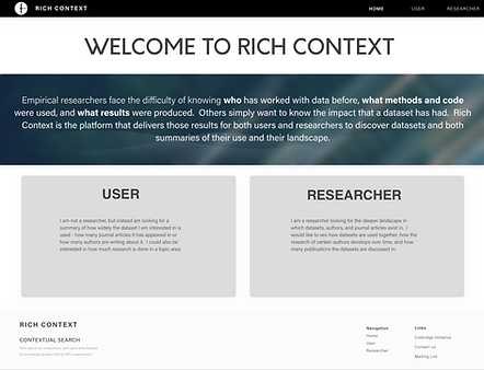
The landing page: allows the two different types of users (despite the confusing type "User" - a request from the project stakeholder for the name of the non in-depth researcher type of user) to take two different paths through the platform.
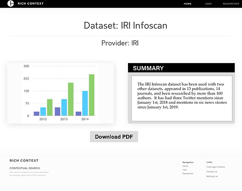
The "soft" user - a journalist or possibly federal legislative aide looking for quick information can get a summary view of a dataset and download a generated PDF for quick reference or to add to a report.


Researchers looking for an in-depth view can look at the knowledge graph itself (view not shown), while also examining results by dataset, journal articles, journal titles, and researchers/author fields. When they click on "More Data", they can find out a summary, a full list of authors, its geometric distance within the knowledge graph to the search term used and topic keywords for the object they are viewing.